
Component Testing
Component Testing
Linting
We use ESLint to make sure all developers follow certain code guidelines when writing JavaScript.
Most code editors offer an ESLint plugin which helps detect mistakes already while you are writing code. To run the linter manually before pushing up new code type npm run lint into your terminal. Most minor issues can be fixed automatically with the command npm run lint -- --fix.
Unit tests
We write unit tests with the help of Jest and Vue Test Utils to make sure our components work in the way they should. In these tests we usually check that a certain input leads to the expected output. They are used to test functionality.
Test files are named <subject>.spec.<ext> and live next to their subject — repo-wide, in every package. *.test.* is rejected by ESLint: Jest still runs both suffixes (so a mis-named file fails loudly at lint time rather than being silently skipped), and letting both live was how one module ended up with two half-overlapping suites.
To run all tests use the command npm test in the /webapp directory. Other useful commands are:
npm test -- -t test-nameto run tests includingtest-namein their file or test namesnpm test -- -oto run tests related to files that have been changed since the latest commitnpm test path/to/component.spec.jsto run a single test file
Documentation and manual testing
Storybook is a great tool that performs two important functions in our project:
Component documentation
With Storybook our components can be documented in detail and offer a visual reference to other developers. When all components are properly documented, Storybook can be used as a big component library – where developers can browse through design tokens and components and immediately verify that the component offers the desired functionality.
Manual testing in an isolated environment
When adding new components or changing existing ones, Storybook can be helpful not only to document the feature for future use, but also to test different use cases (e.g. by passing different types of props) in an isolated playground.
With the right addons, Storybook also gives immediate feedback on how well the component complies with accessibility guidelines.
To run Storybook, first start the app, then enter the following command in a new terminal window: npm run storybook. The output should look similar to this:
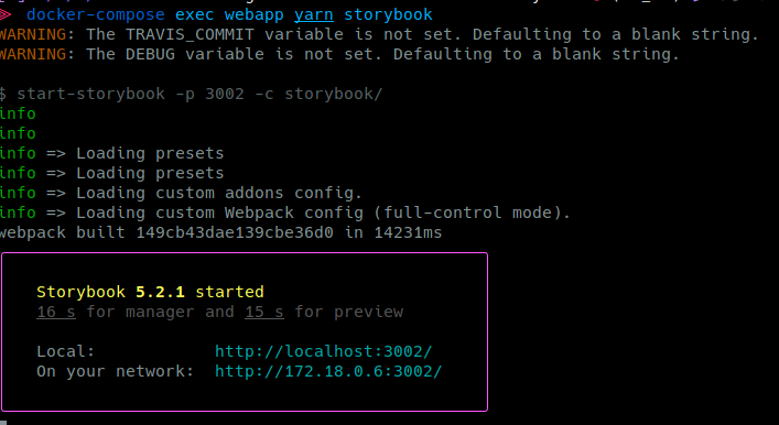
The ocelot.social Storybook will then be available on http://localhost:3002.